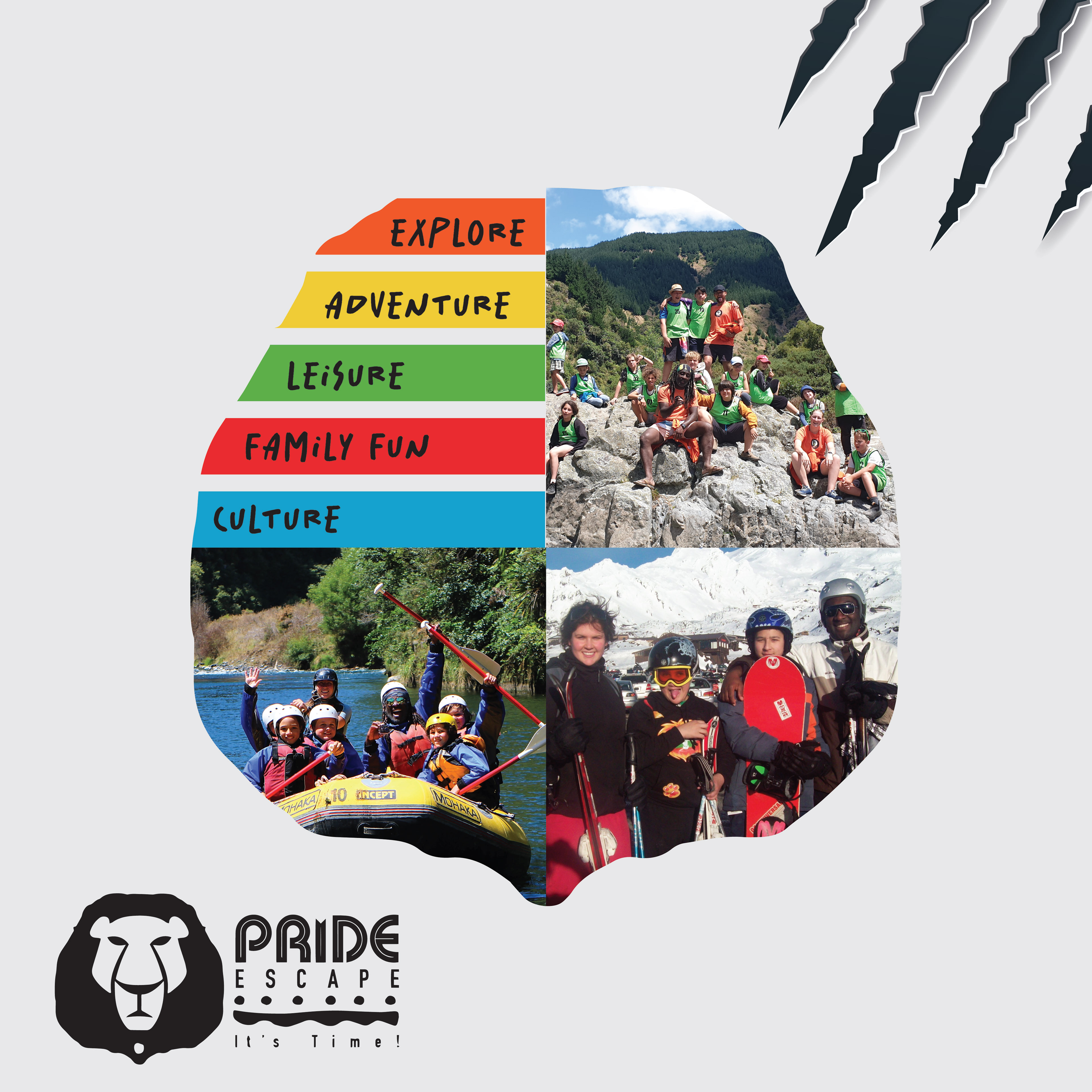
I've been working for this brand for a while and we decided to make a brand identity to support the logos.


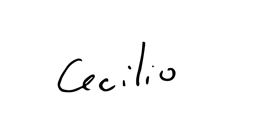
Just to explain a bit more about what this is: Pride Escape is a once a year holiday plan provided by Pride Lands Childcare in New Zealand. It is a vacation for kids full of adventure and learning moments to make the kids holidays more memorable and fun.
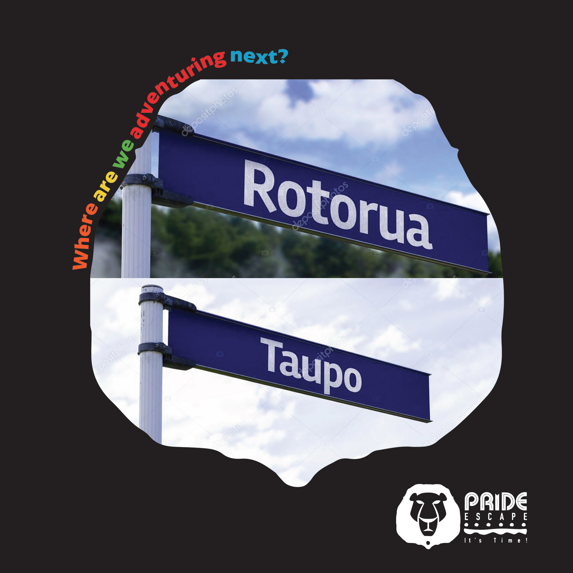
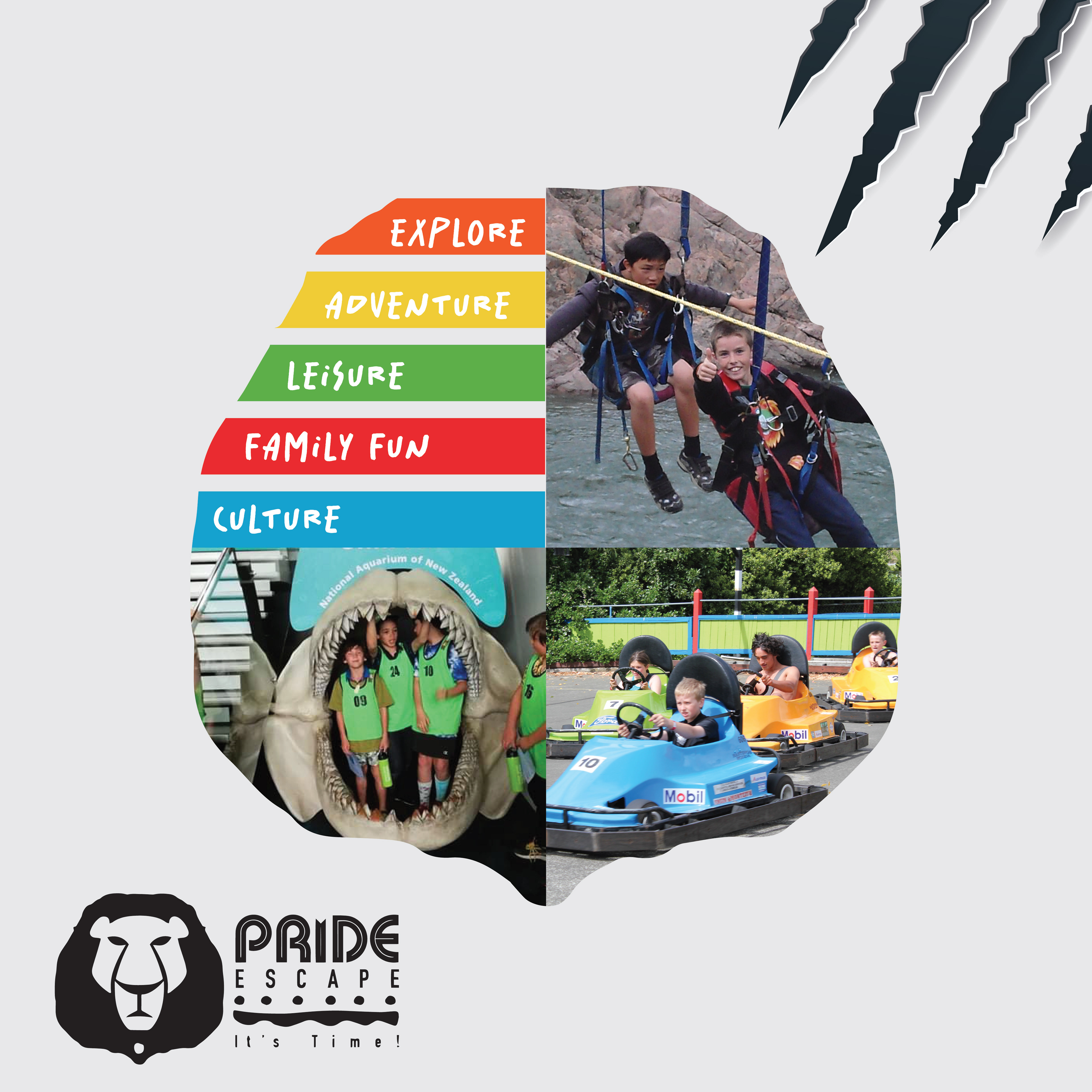
So at first we worked on the principals of Pride Escape and built their advertisement with hints about the next travel location to make it fun for the parents and kids try to guess.
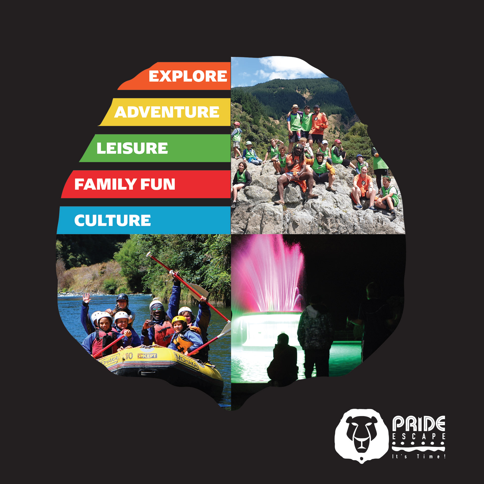
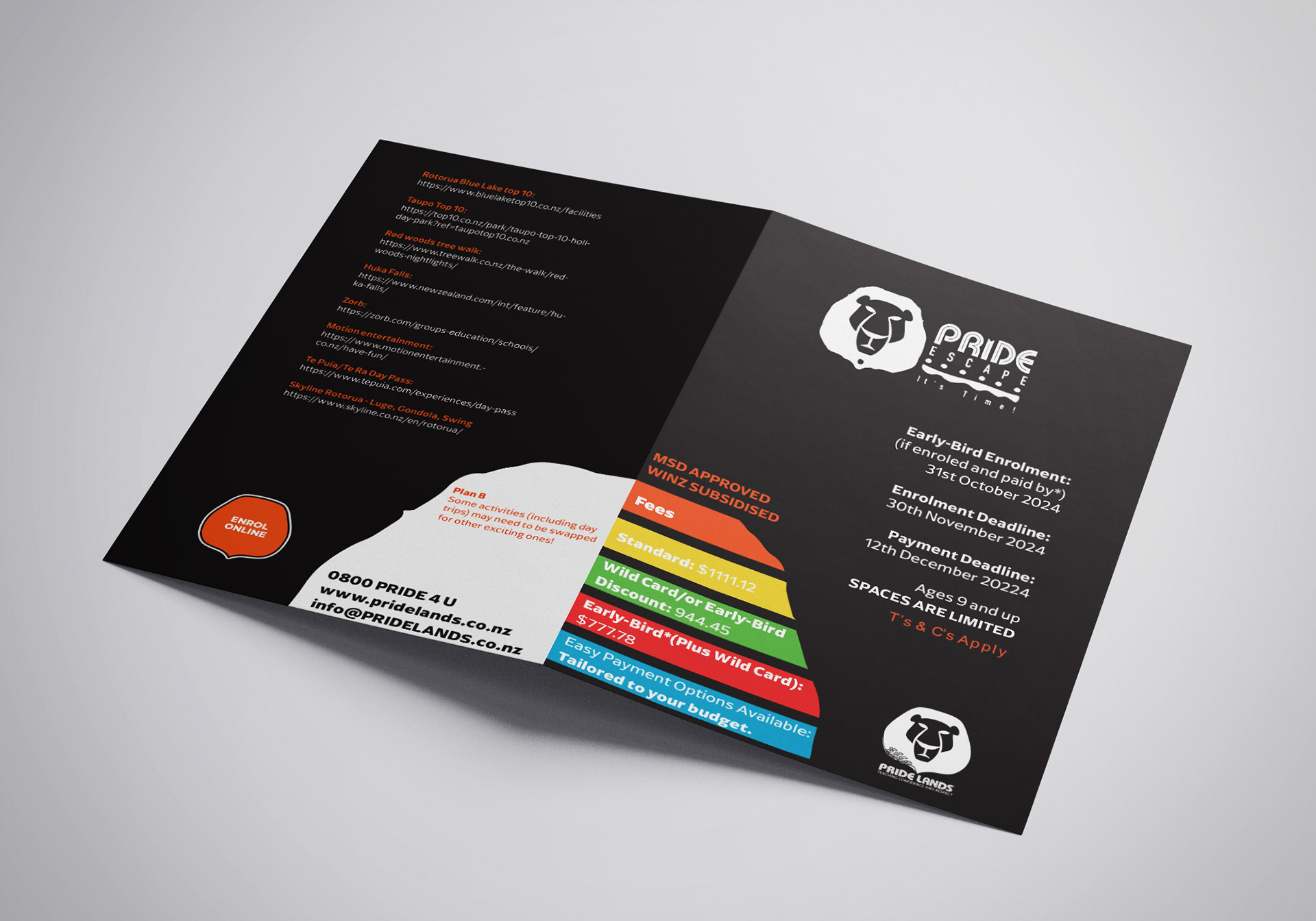
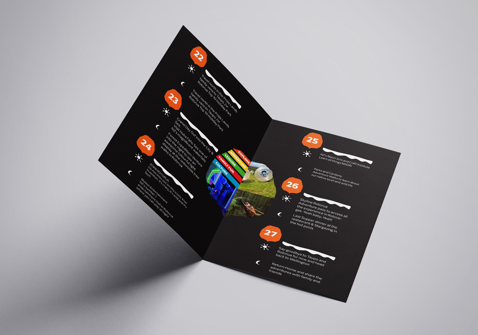
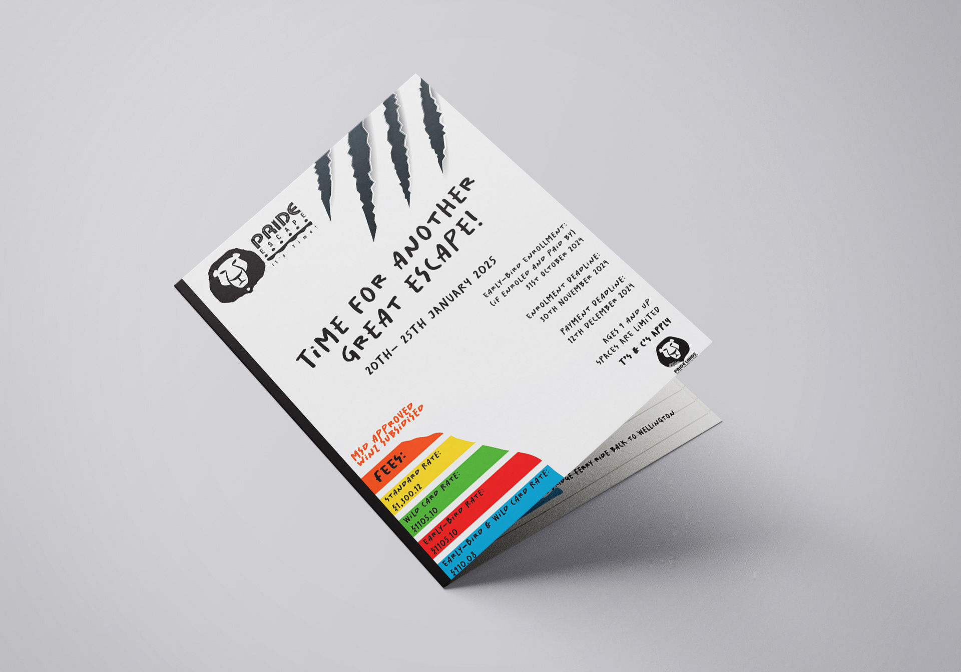
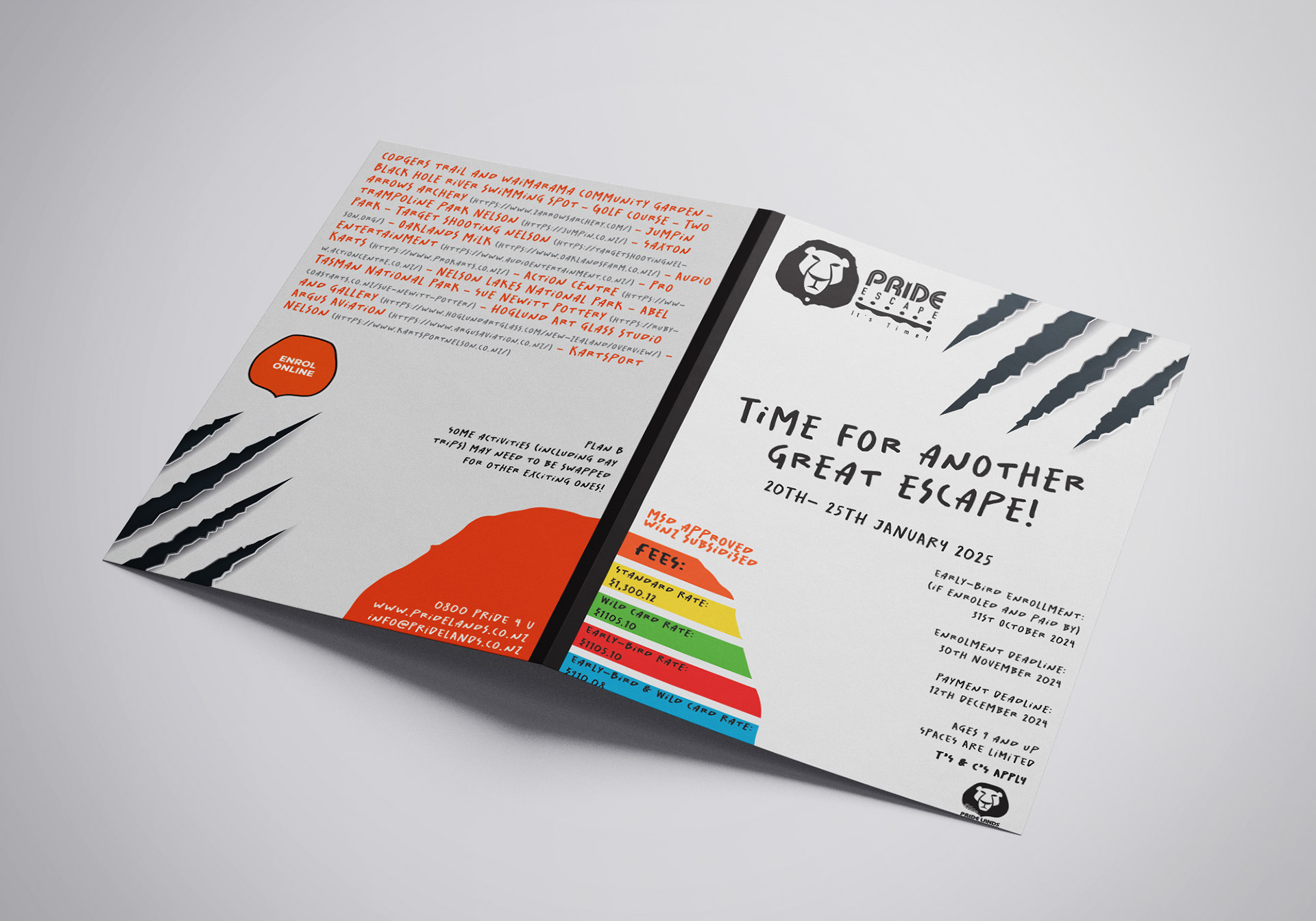
Next I created the flyer for it with all the information based on what we've been working on:
But now I had another challenge, because we needed to create another flyer for the next adventure in a way that stood out but still kept the principals stablished by their identity.
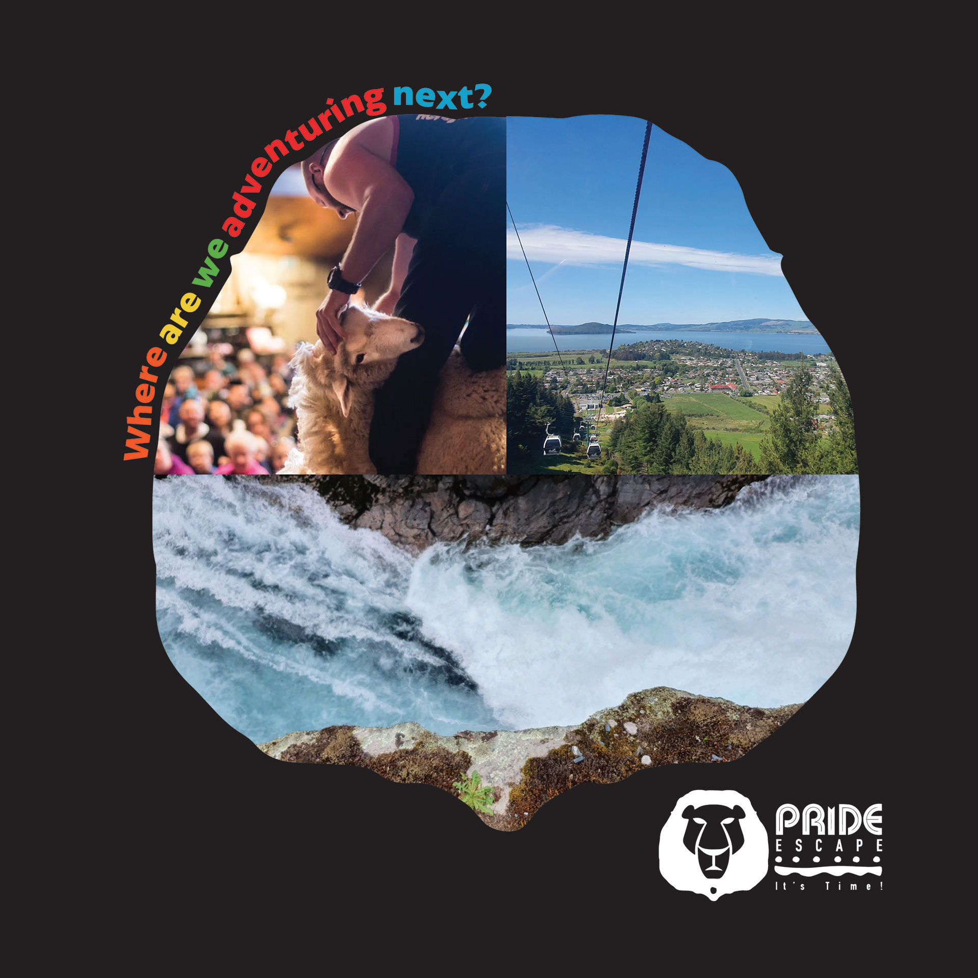
We had an idea to do something based off of this:
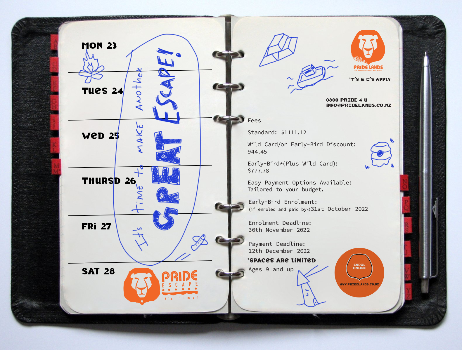
Looks way too different right?
But this was more an idea in regards of we wanted it to be a bit more informal, something that we count the days down till the trip arrives, so we know we're excited for it and more kid involved somehow.
So this is what I created:
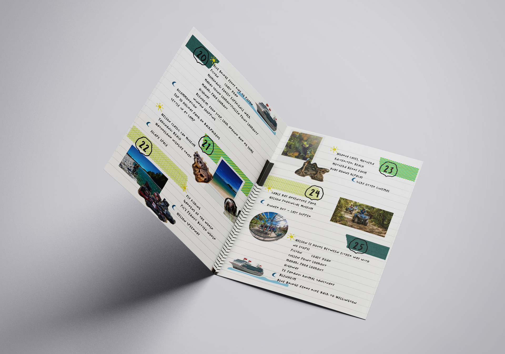
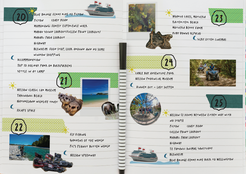
A school notebook/ bullet journal to emulate the kids planning of the trip but most importantly keeping the key elements of the identity created for Pride Escape, just a little more updated and polished.